Spring On-Air Branding
Art Direction & Branding
Spring On-Air Branding
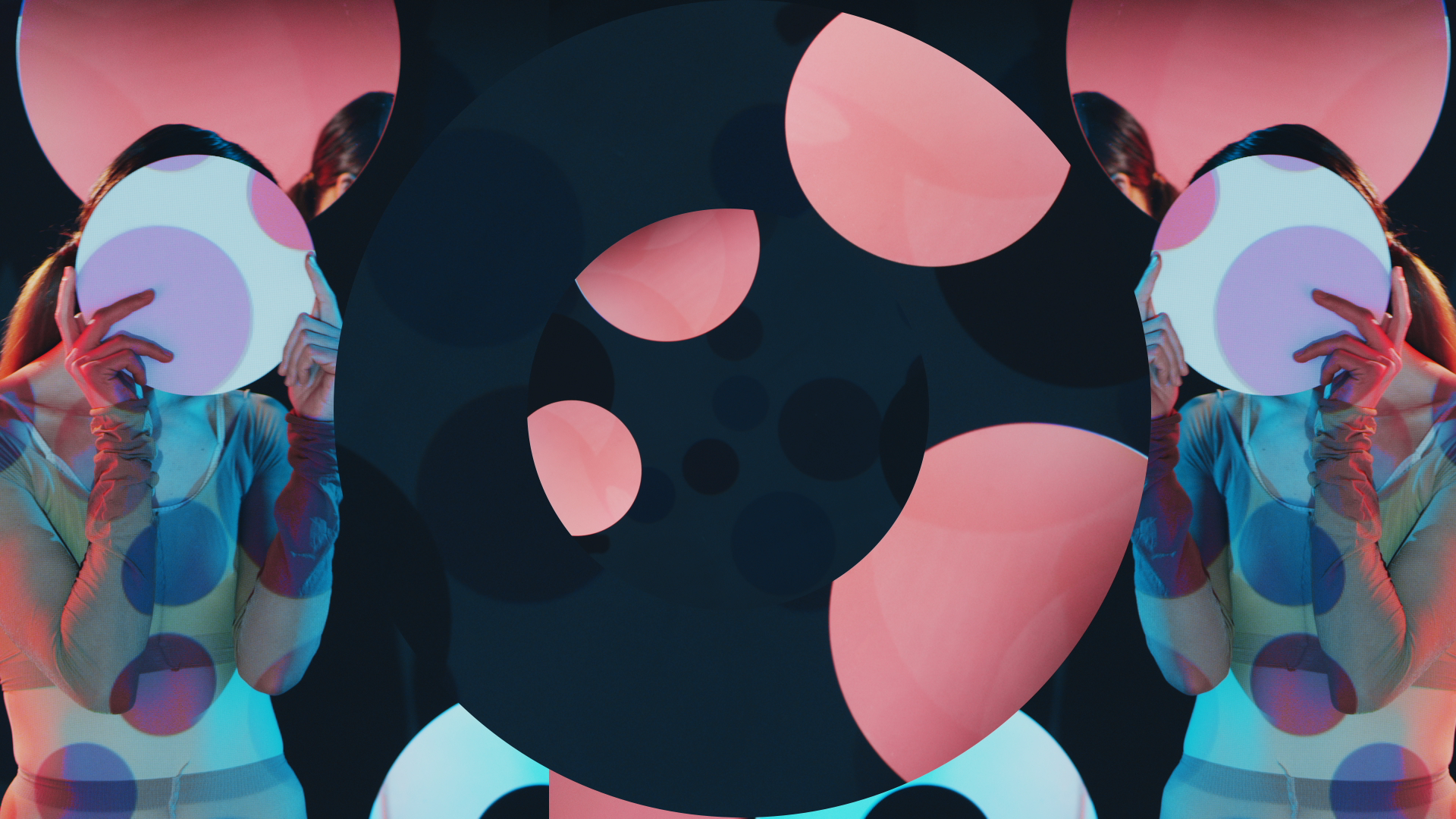
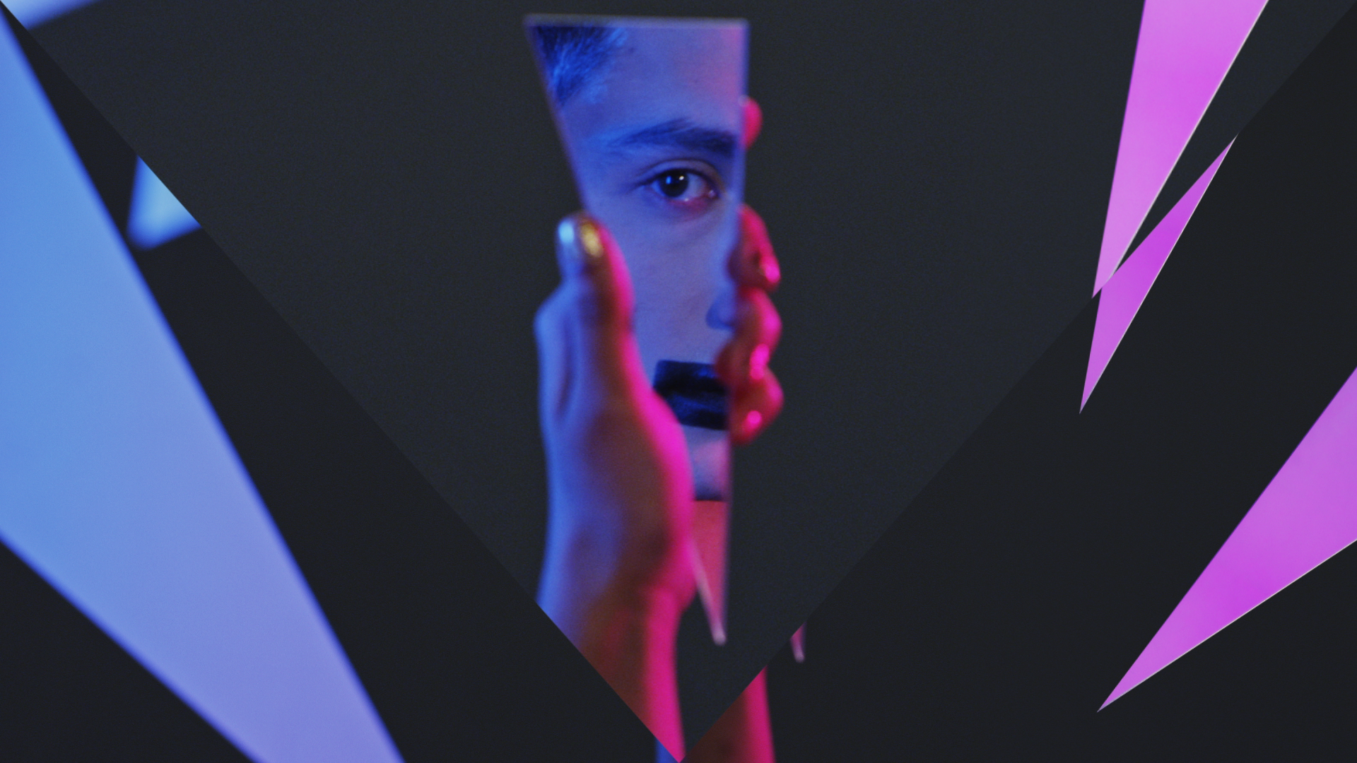
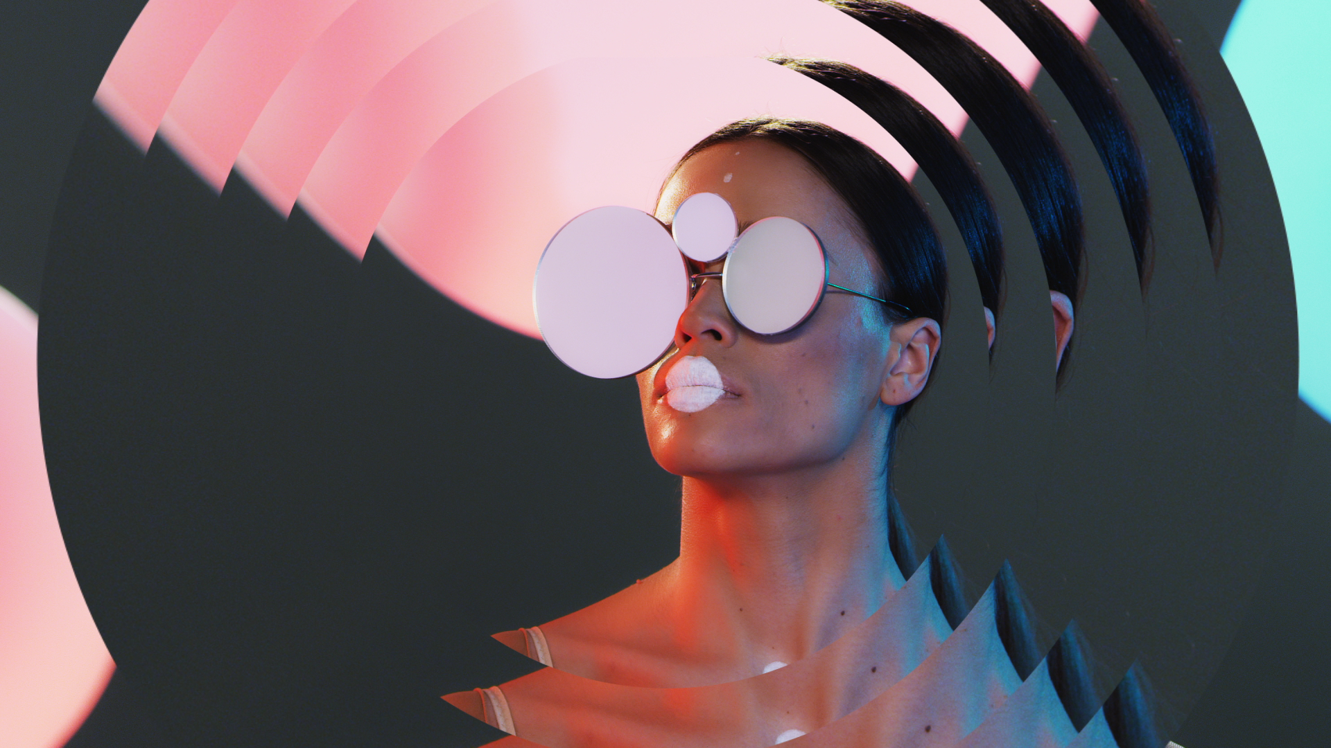
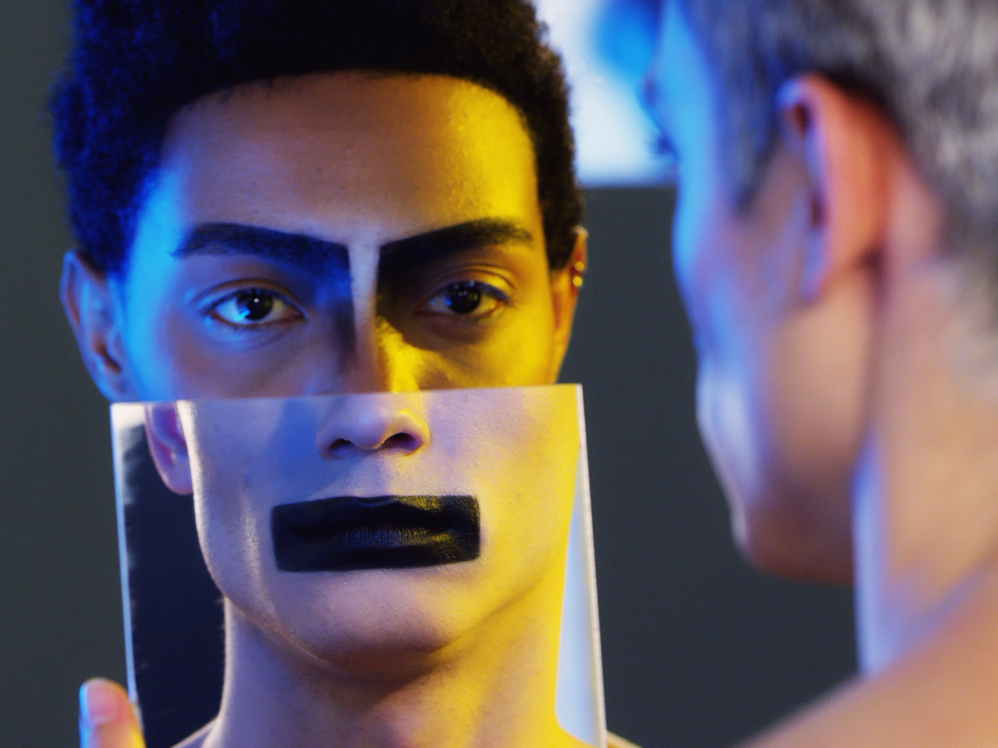
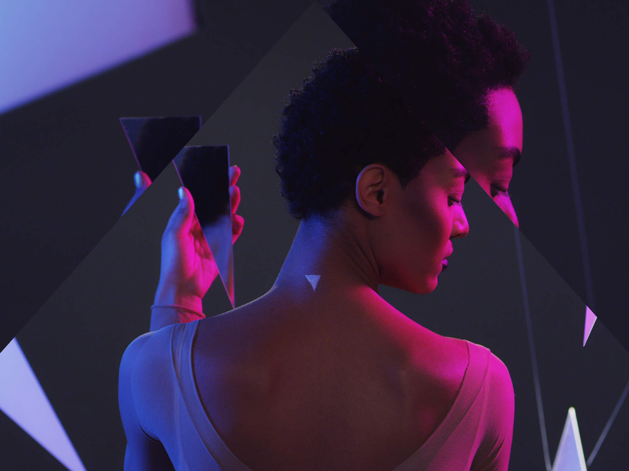
On-air branding for TET TV’s spring season, inspired by Stravinsky’s music and Diaghilev’s ballet The Rite of Spring. The concept explores the geometry of the human world - with the circle symbolizing femininity, the square masculinity, and the triangle androgyny.
Through rhythmic motion, color, and form, the identity transforms musical harmony into a bold visual language celebrating balance, energy, and transformation.